Staying visible is a big deal for any business. Whether you’re running a fleet or managing a storefront, if people don’t notice your brand, they’re not likely to remember it. That’s where exceptional graphic design comes in. It’s about more than just good-looking colors or logos. It’s how we help our brands show up and stay top of mind, out in the real world.
From the side of a delivery truck to a busy event booth, strong design is what invites someone to look twice. It keeps consistency across your whole business and signals that you’re professional, clear, and serious about your work. Good design doesn’t talk over people, it helps them remember who you are and what you do.
Visual Branding That Stands Out
When we talk about brands that stick, we usually picture clear colors, easy-to-read type, and something that feels familiar. That’s visual branding at work. It lets people pick you out in a crowd and builds a sense of memory each time they see your name or look at your vehicle.
• Color choice is one of the first things someone notices. If it doesn’t match across your signs and logos, it can confuse the message
• Layout, that’s how everything sits together, matters just as much. A design that feels scattered makes your brand feel messy
• Style pulls it together. That includes if it’s bold, clean, fun, direct, or something else that speaks to how your business shows up
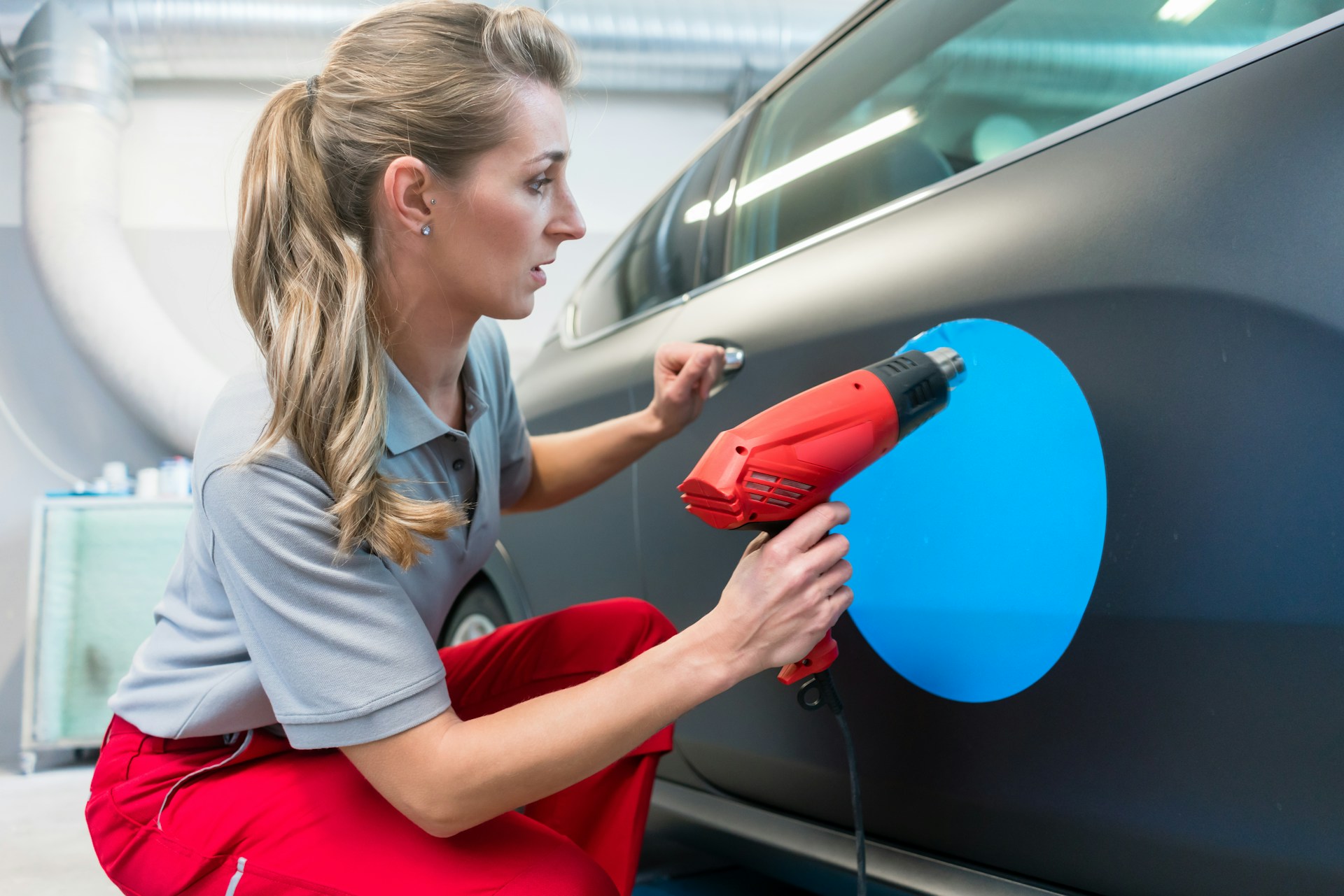
People often get their first impression from a wrap on the side of a truck or a roadside sign. These quick moments need designs that aren’t just eye-catching, but also clear. If your design gives someone a clean look at who you are, they’re more likely to remember it later.
Visual branding isn’t just for the big names. Even local businesses, delivery companies, and small shops can stand out with their own style. Maybe it’s a certain shade of blue that pops up on every truck or a playful font that makes your window graphics feel welcoming. No matter the size of your business or fleet, keeping your branding consistent helps customers recognize you wherever you are.
Why Design Consistency Builds Trust
Consistency might not be exciting, but it’s one of the most important parts of visual design. When a brand always looks the same, same fonts, same colors, same placement, it sends a message that things are stable and under control.
• Customers tend to respond better to businesses whose signage, vehicle graphics, and marketing all look like they belong together
• Small changes, like mismatched colors or logos that don’t sit quite right, can make a brand feel unfinished
• Familiar design gives a sense of security, especially for people who see your business again and again
That kind of design is doing quiet work. It doesn’t shout. It just makes your business feel steady and reliable. Over time, this builds trust. People don’t have to guess who you are or wonder what’s coming next, it’s already in the look and feel of everything you put out.
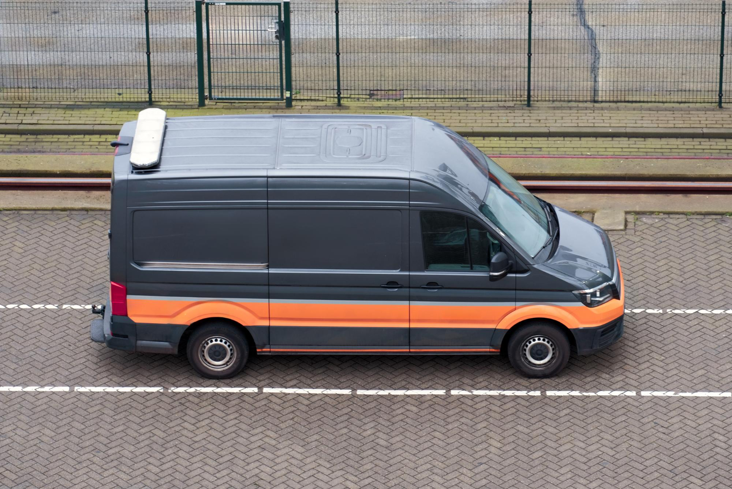
For delivery companies and fleets on the move, trust shows up in all the places your company appears. It’s on the painted doors of your vehicles and the wraps on your trailers. If every piece looks like it belongs together, your brand sticks in someone’s mind. When people see trustworthy design, they’re more likely to reach out, remember you, or recommend you to a friend.
The Role of Layout and Readability in Graphics
Design isn’t only about being noticed. It’s about what happens after someone looks. Can they read the message? Do they know what you’re offering, or how to reach you? That’s where layout and readability show their importance.
• A clean layout keeps distractions away. It places core words or images where the eye lands first
• Font size and spacing matter more than most think, especially when your graphics are seen from far away or at high speeds
• Strong contrast makes things pop, like white text on a dark background, helping the eye find meaning fast
• Placement of details like phone numbers or taglines can decide whether someone remembers or forgets the message
We never want designs so full that they feel crowded. A good use of space keeps attention focused, leaves a good impression, and makes it easier for people to remember what they saw.
Sometimes, getting the right balance in a design means letting some space stay open. It allows your logo, message, and brand color to speak with impact without fighting for attention. The way information is ordered, your business name first, the service or tagline next, contact details where eyes naturally go, means even when people only have a second to look, they get exactly what they need. Good readability also helps ensure those quick glances when trucks pass by or people walk into a store become meaningful, lasting impressions.
Seasonal Relevance and Durable Design
By late February, most places are dealing with rough roads, cold temperatures, or wet conditions. That affects how graphics look and last. It’s smart to think about what your designs need to stand up to and make choices to match.
• Spring often gives businesses a chance to refresh designs that took wear during the winter
• Outdoor graphics and mobile vehicles face regular exposure to weather, so timing updates before spring rush is smart
• Fleets that travel between regions need designs and materials that don’t fade or fall apart when conditions shift
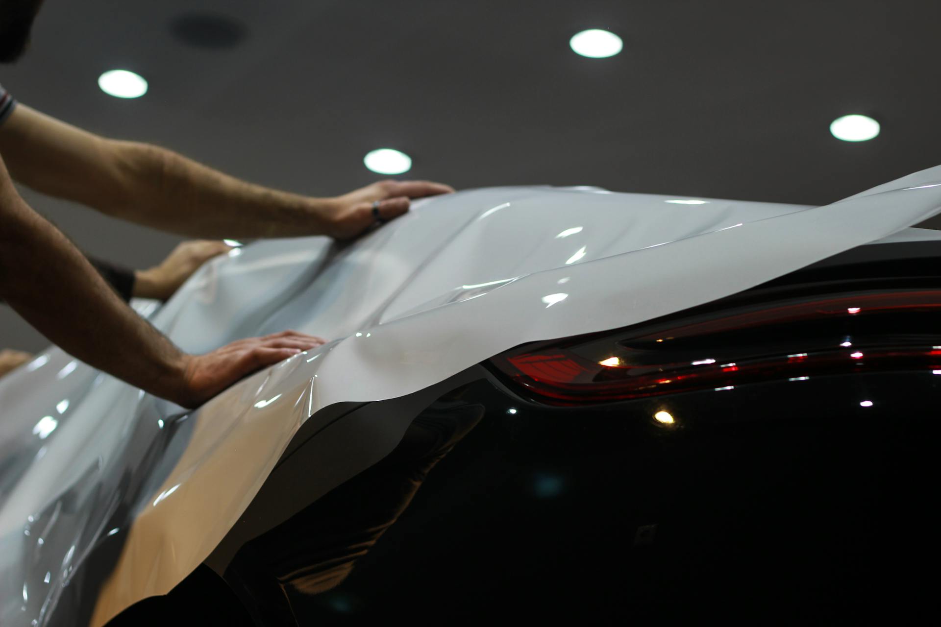
This is where design works hand in hand with material. It’s not just about how a wrap looks, but whether it lasts after weeks of harsh salt, sun, or rain. Making those updates early can keep branding consistent through the season ahead.
Spring can be unpredictable, from rain showers to sunny afternoons that bring glare. Durable design uses inks and materials that keep shapes and colors true, so your graphics don’t peel, fade, or bubble as the temperatures change. For delivery trucks, bright bold graphics can help vehicles stay visible through the splash of spring rains or cloudy mornings. Getting ahead of weather means your brand looks fresh, even as the seasons shift.
Strong Design Keeps Your Business Top of Mind
Hyperformance Graphics offers graphic design services that cover everything from new logo creation and fleet graphics to indoor and outdoor signage. We use a step-by-step design process, including proofing and visuals for approval, so each design meets your needs and holds up in real-life settings. Our team takes pride in creating eye-catching graphics for vehicles, windows, and custom signage that look as good on the road as they do in your lobby.
When our graphics are clear, clean, and consistent, they do more than just decorate, they remind people who we are. And when they show up across all the places our business touches, from buildings to vehicles to event setups, it builds something steady and recognizable.
Whether someone remembers our name from a passing truck or sees the same colors on a sign outside a building, that impression sticks around. With strong design behind it, our branding becomes hard to forget. That’s where exceptional graphic design really proves its worth. It supports visibility right now, and keeps it growing over time.
At Hyperformance Graphics, we create designs that do more than catch the eye, they tell your story clearly and consistently across trucks, signs, and displays, leaving a lasting impression. Strong layouts, thoughtful color choices, and the right tone on every surface give your brand the attention it deserves. When you want to strengthen your image with exceptional graphic design that stands out on the move, let’s connect and start planning your next project together.