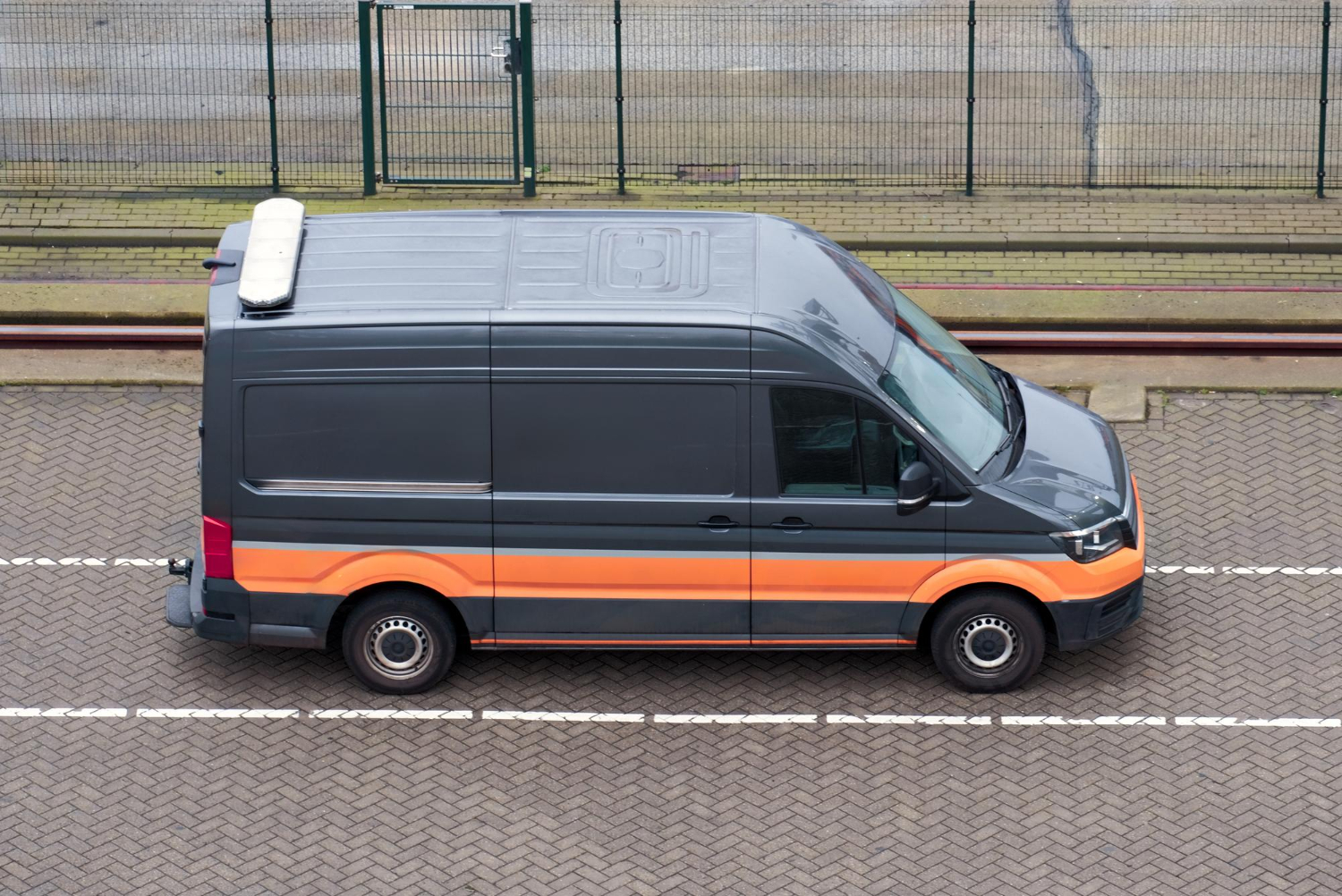
Large-format digital printing plays a big role in how businesses present themselves. Whether it’s a fleet of trucks, trade show displays, or banner signs, these visuals can tell people a lot about a company before a single word is spoken. When the quality slips, even just a little, it becomes obvious fast. Blurry prints, strange colors, or peeling materials don’t leave the kind of impression anyone wants tied to their name.
That’s where quality control comes in. Every step, from setting up the files to selecting materials and finishing the print, matters if you want something that looks great and lasts as long as it should. Good quality control means fewer do-overs, better visual impact, and happier customers. Here’s how that gets done in large-format projects.
Quality Checks for Print Resolution and Clarity
When it comes to large-format digital printing, resolution isn’t just some technical detail you can ignore. It’s what makes a wrap on a trailer look sharp instead of pixelated from just a few feet away. Low resolution leads to washed-out images and fuzzy lines, which can really take away from the design you had in mind.
To help avoid that, here are a few things you should cover before and during printing:
1. Start with the right file type. Vector graphics work better for logos and text since they can be scaled without losing quality.
2. Use high-resolution images. Photos should be at least 150-300 DPI at full size.
3. Double-check scaling. Sometimes files get stretched or compressed during the setup, which can cause distortion.
4. Run test prints when possible. Doing a small section first can help spot problems before the full job is printed.
Even with the right files, printer calibration matters too. Neglecting to clean or maintain the equipment can leave lines, banding, or blobs of ink that ruin the surface. For example, dirty print heads or uneven substrate loading might cause a streak through a truck wrap or fabric banner that won’t go unnoticed.
Being hands-on during the early stages and keeping an eye on these technical details helps ensure cleaner, crisper results that get the job done right the first time.
Color Accuracy and Consistency
Color control is one of the trickiest and most overlooked parts of the large-format process. What looks bright red on a computer screen might print slightly darker, or the company’s signature blue ends up leaning more toward purple if printers or profiles aren’t tuned right. These color mismatches aren’t just annoying, they affect the whole visual identity of your brand.
Keeping colors true from design to print calls for a few key practices:
– Calibrate monitors and printers regularly. What you see on a screen is only as accurate as the equipment allows.
– Use color profiles made for specific printers and materials.
– Choose Pantone colors or CMYK mixes carefully to match your branding.
– Set up a control print as a color reference for every job.
Consistency across different runs or materials is also worth watching. A business may need truck panels printed one month and indoor signage the next. If the colors are off between the two, it can make you look unorganized. Keeping detailed records of print settings, materials used, and approved color samples can help avoid surprises later.
The goal is to make sure the reds stay red, the images don’t wash out in the sun, and the colors work together across platforms and surfaces. Whether it’s one piece or a full fleet, color should stay true from start to finish.
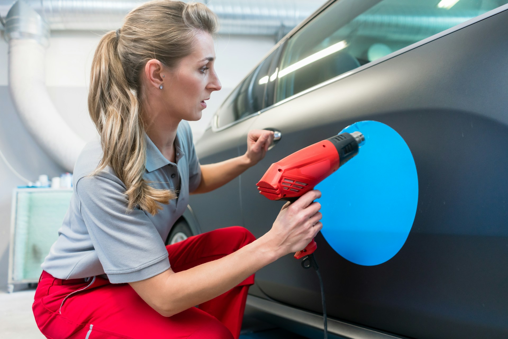
Material Inspection and Selection
Every project starts with the surface it’s printed on. Using the wrong material can lead to fading, peeling, or poor adhesion, especially for outdoor applications like vehicle wraps or signage. Taking the time to inspect and choose the right substrate makes a big difference in how the final piece looks and how long it lasts.
Some materials work better for indoor use, others are built to stand up to sun, rain, and even highway grime. It’s important to match the material to the conditions it will face. For example, vinyl that’s meant for short-term event signage may not hold up well on the side of a truck cross-country in the summer heat. On the other hand, high-performance cast vinyls with UV protection can handle those extremes better.
Before committing to a material, it’s smart to:
– Check for defects, like small tears, uneven textures, or discoloration.
– Make sure the surface is clean and has good adhesive compatibility.
– Confirm that the material is rated for the right environment (indoor, outdoor, long term, etc.).
– Test print a small section to see how it takes ink and how vivid the colors appear.
Touching the material and feeling its quality can sometimes tell you more than a spec sheet. If it feels too stiff or flimsy, it may not shape well on curves or edges. That could mean problems down the road when it’s time to apply it or when it starts being exposed to the elements.
Final Finishing and Laminating
Once the ink is laid down, the job still isn’t finished. Finishing and lamination are what protect the print and give it a professional feel. Without that extra step, even the highest-quality print can wear out faster, scratch easily, or start to fade early.
Different finishes work for different goals. Glossy laminates offer extra pop and shine, which works well for things you want to stand out, like point-of-purchase displays or event signs. Matte coatings may reduce glare and give a cleaner look, especially for indoor prints. There are also textured laminates that improve grip for floor graphics or make materials easier to clean.
Finishing techniques go beyond lamination. These might include:
– Edge trimming and rounding for smoother profiles.
– Adding grommets or reinforced edges for banners.
– Mounting prints on rigid substrates like foam board or aluminum.
It’s also worth thinking about how your printed piece will be handled. If the surface will face regular wear, like a vehicle wrap or sign in a high-touch area, lamination becomes even more important. If the print is going outdoors, UV protection in the laminate will help prevent it from fading under the sun.
When done right, the finishing steps help your prints stay looking sharp longer and protect your investment from the wear and tear of daily use.
Keeping Your Prints Looking Great
Building quality into every step of a large-format printing project isn’t just about fancy equipment or expensive materials. It’s a mindset. Whether it’s picking the right substrate, checking that the ink sits just right, or making sure the laminating process is clean and free of bubbles, every stage gives you a chance to improve or ruin the final result.
Regular checks and good habits keep jobs running smoothly. Simple actions like organizing your proofing system, logging project settings for future runs, or checking that print heads are clean before every shift help prevent problems. Pausing to inspect a printed roll before moving it to the next step takes just a second but saves hours on corrections later.
There’s also a long-term benefit. Businesses that stay consistent with their branding know exactly how they want it to look in every space—from storefronts to fleets. Keeping quality high helps support that brand. People notice when things look faded or off-center. They also notice when prints look clean, vibrant, and well installed.
When those little details are treated with care, the results speak for themselves. Clean lines, bright colors, and long-lasting materials leave a strong impression wherever they go. That’s what quality control is really about: making work people are proud to show off.
For businesses that rely on bold, long-lasting visuals to tell their story, having the right approach to large-format digital printing makes all the difference. From choosing the right materials to applying expert finishing techniques, Hyperformance Graphics brings precision and care to every project we take on. Let us help you create prints that leave a lasting impression, wherever they go.